Saturday, 30 June 2012

Never Say No to Panda

Ever subscribed to newsletters but then get bombarded with an onslaught of offers and seemingly non relevant communications?


Their strategy? Eventually you will capitulate, no matter how many times you say no.


Never say no to Panda..see the whole range here

Thursday, 28 June 2012

My Apologies Again....


But every time I drink a glass of Piccini Chianti Riserva 2008...


Italy win!!!


Can someone send me a case please?

Habit Forming in Online Grocery Shopping

This email was brought to my attention by the Alchemy Worx Favourite email article, so I won't go into detail about the email itself but focus on the mechanism they have to create a shopping habit.


As you can see , Tesco are offering a saving of £20 on your groceries.

This is how it works though, you actually have to make 3 individual shops and spend £40 each time to get the money off. So essentially spend £120 and get £20 off.

Then logic behind this is quite simple. As we all know in online shopping , the second purchase is sometimes harder than the first - which may have been prompted by another offer..( see Ocado examples).

I'm guessing that for Tesco, getting the 3rd shop is also a key tipping point as you are now getting into the habit of shopping with them.


Below we see how Ocado focused on the second shop a couple of years ago
Another grocery retailer I worked with actually established that 5 was the magic number.

So Alchemy Worx were right to place the email in the Strategy Award.. but Tesco only get my vote if they have targeted the email at a segment of their base that need nudging from the odd shop or two , to much more of a habitual Tesco online shop.


It does seem to be going to existing customers, because of the personlization of the products, but I feel that perhaps the introductory copy could have been more explicit about how these customers have tried the service already


One very complicated way of doing this is highlighted by the way that Waitrose promoted their home shopping in their in-store publication Waitrose Weekend  .


I prefer the Waitrose mechanism as it rewards each individual shop with the reward increasing as the relationship grows, and it equates to a 20% discount in comparison to Tesco's 16%. You could argue that Waitrose have more margin to play with.

Maybe we'll see that mechanism appear at some point in email, although it would greatly simplify things for the customer if they only had to enter 1 code at the start of the series of shops and the e-commerce system just gave the ever increasing discount each time they shopped!

It's interesting to note the difference in the spend target each retailer is aiming for - a reflection of the average basket value for the majority of their customers and their cut off point for ensuring a profit on the service


Wednesday, 27 June 2012

Experience Matters


Set the scene in a laboratory

A human has 2 buttons to push
Every time they push the small red button food is dispensed
Every time they push the square blue button nothing happens

Result

Every time the human gets hungry they push the red button and will pay little attention if any to the blue
(Ok so maybe this was done somewhere with chimps but I didn't want to hurt any animals in making this blog post)
So, experience matters. As humans we are are obviously wired to go to where we have a rewarding experience.


Now let's get the Brand team involved.

When we ask these subjects, I mean consumers, how they felt about the red button they will probably translate the dispensing of food into statements such as

..an enjoyable experience,

.. A button that matched my lifestyle, for people like me

...something I'd recommend to my friends.

You get the picture
The consumer's experience is defining the brand rather than the actual colour or shape of the button

Loyalty

What if every now and again , the pressing of the red button results in no food? Previous experience results in us giving them a second or third chance because it has served us so well in the past.
But if it continues to fail to meet our expectations, then I can imagine the blue button beginning to seem more attractive...especially as we get hungry

Consistently meeting our expectations to a certain extent buys loyalty - for a while

Tuesday, 26 June 2012

5 Email Subject Lines You'll Never Read But You Actually Get Every Day


If every email you sent cost the same as a piece of direct mail, you'd think twice before sending your next campaign out...wouldn't you?

  1. 50% Off Items  in Colours You Won't Like And Are Not Available In Your Size
  2. A Further 20% Off the Stuff You Didn't Want to Buy at Even 50% off
  3. You've Never Opened an Email From Us Before But It Doesn't Cost Us Much to Send You Another
  4. Some Great Offers Based on What Someone Else Bought
  5. Don't Bother Reading This On Your Mobile

Other Contributions Welcome........

Monday, 25 June 2012

Choosing a New ESP Partner

Following on from my recent posts ' What we learned selecting an ESP Partner: Work Backwards' and 'Picking a ESP?' , I thought you might be interested in the Whitepaper produced by ClickMail 'Digital Marketing Solutions Guide: 29 Factors to consider in 2012'


For each of the 29 factors, this guide covers:
  • Why it matters
  • What to look for
  • Which questions to ask

Sunday, 24 June 2012

A Slight Distraction from eCRM - An Amazing Italian Day


Fernando Alonso, 29 vittorie in F.1. Ansa

Ferrari Win the European Grand Prix


A Drop of the Good Stuff


Almost Like Mamma Makes


Forza Italia!!

Favourite Subject Line of the Week

Non Opens from an email campaign can be a useful segmentation and trigger

I received this email today, Saturday 


Actually I had all of them, so this was a nice and timely reminder. The Wine Club had obviously looked a their non opener file for the sequence of 5 emails and and used that to trigger a reminder message to me


Not only that, but they summarised the deals within the email, negating the need for me to trawl though my inbox .


Saturday, 23 June 2012

A Till Called Garry

As I walked away from this self checkout machine in Boots


I glanced at my till receipt and noticed that
I had been served by GARRY

Nice to put a name to a till

A Day in the Internet

I came across this interesting infographic on information consumption on the internet

A Day in the Internet
Created by: MBAOnline.com

Friday, 22 June 2012

Lifecycle Marketing - It's All about Customer Needs and Wants

Individuals might look the same but that doesn't mean they will act in the same way or indeed need the same things.

The combination of choices of good and services available to a customer and the wealth of communication channels available to a brand make it a complicated world. This is the challenging environment a brand faces when it is trying to get a message through to a prospect or indeed an existing customer.

But by cracking this nut and treating customers at an individual level can pay massive dividends when trying to measure ROI. At the end of the day that's what it is all about, numbers

But ROI can't be built around a neat little profile of what customer segment ' Jason and Trudy' look like. ROI can only be built around what Jason and Trudy actually do, or what we can get them to do.

And ultimately, we can only get Jason and Trudy to do something if we interact with them in a way they control and are comfortable with AND that costs in for us.

If they want us to talk to them about baked beans via expensive pieces of direct mail, it just wont happen. Conversely, if a prestige car brand thinks it can sell premier quality cars via email only they are going down a one way street, the wrong way!

As shown as far back as the 2009 Forrester Research survey, “Profiling the Multichannel Consumer,” 70% of U.S. consumers that research online and purchase offline, 85% are multichannel buyers. Many organisations estimate that as much as 50% of their customers — typically those of highest value — purchase across multiple channels


In reality, a multi channel approach has been shown to work best, as long as we are mindful of the following

1- the messages coming through those channels look like they are coming from the same organisation. And by look I mean that they look, feel, sound and taste the same.

2 - each of the channels is used to it's strengths and and on what the customer or potential customer wants to use it for. Part of that involves understanding the lifecycle at a macro level , often depicted as in Figure 1
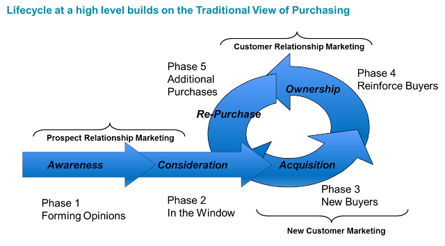

Figure 1

And the understanding what customers want or need at those various stages. As in any journey, the things you need will differ depending where you are on that journey, and there are other things you  don't want. The brands role is to match these needs and wants with content that is relevant and hence results in engagement - Figure 2.  
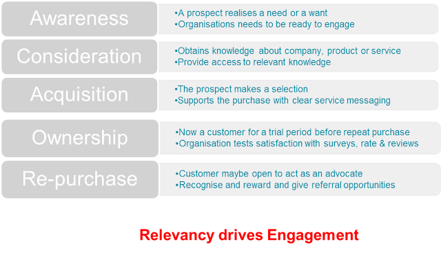


Figure 2


What's the best way of finding out what customers want ?. Ask them and Test your approach because ultimately it' about what customers do rather than what they say will do.

Actions based on a combination of what customers say and do will ultimately smooth their path to purchase

Behavioural Marketing eCRM and Euro 2012

eCRM marketing programs based on behaviour will outperform those based on past purchase of declared data

That was one of the take outs from a webinar I attended this week, presented by Lyris and Forrester ( checkout #Lyriswebinar on Twitter)

For those of you that noticed by post that had nothing to do with eCRM this week, you may have noticed a slight allegiance to the Italian football team. I may even have purchased some Italian sports kit from Puma in the past

Well, during the last couple of weeks, I may have also spent some time browsing at the Italian products on the Puma website.


So ,despite the fact that 8 teams have qualified for the Euro 2012 Quarter Finals, it was good to see this subject line in my inbox


That was sure to get me to open ( although the key ring was superfluous, maybe it was a test)

And that was followed up with a nice piece of tailoring with the Italian team being the first image - They can be forgiven for not having the actual starting line up that won the game to confirm qualification


As I haven't bought anything from Puma for quite a while, I'm going to assume they have looked at my recent web behaviour, although they may very well have taken both into consideration before targeting this content at me.

Anyway, top marks for segmentation and timing..not sure about those dodgy key-rings though

Thursday, 21 June 2012

Thinking App? Think Android

The most annoying headline in my inbox usually includes the words 'Download our iPhone App'


The latest smartphone sales data from Kantar Worldpanel ComTech shows Android taking the European market by storm with its share of the big five countries growing from 38.8% in May 2011 to 60% in May 2012. It has also retained its number one position in the UK in the latest 12 weeks with 52.5% share, up from 48.3% a year ago.*

Thinking iPhone App? Think again


*souce Kantar Worldpanel Comtech

Wednesday, 20 June 2012

Welcome


Where Do I Sign Up? talked about some best practice tips on making email registration easy, while Where Do I Sign Up? 2 highlighted some of the roads that can lead to registration. And my last post on signing up looked at some of the Thank You for Signing Up Pages

Now of course the next important stage here is to consider how you then Welcome the subscriber by email.
When you consider that the Welcome email is often the most opened email in the whole programme, its worth considering taking some time to make sure you are getting it right. After all, this is the point where the consumer has just given you permission to speak to them.

Rather than re-invent the wheel here, I'm going to point you in the direction of an excellent whitepaper from the Inbox Group that gives some great insight into the Power of the Welcome


Exploit the Power of the Welcome can be downloaded here

The Olympic Torch - Always Good for Conversation

On my way to the railway station this morning guess what I bumped into?


Good to see that over 200miles away from the main location for the Games, London, this piece of history can generate some interest ( and you know how much I admire the Ancient Greeks)

Of course in this moment to shine...it was good to see another institution shine as well...or is that hi-jacking a conversation?


Some of the overheard conversations...

- why is there such a queue in Starbucks today?
- the torch just left the Minster

- is the torch going through the city again today?
- no, you just missed it.
- phew..I didn't want to get stuck in the traffic

- can I have 2 flags?
- you'll need to buy 2 papers

- ooh that's a nice t-shirt

It was great to see 2 such great brands side by side later as people needed a rest after the excitement.


Calculating Lifetime Value : Infographic

Useful Lifetime Value Calculation via Infographic from Kissmetrics


How To Calculate Lifetime Value – The Infographic

Tuesday, 19 June 2012

Will 'Showrooming' Kill Businesses?

Those of you who read my piece on showrooming might be interested in this piece on CNN by Bob Greene

Symbols in Email Subject Lines

Let me say this once. Please don't

You know what I'm talking about right?
Some brands have decided that they need stand out in the inbox so are experimenting with adding symbols such as the one below in their subject lines


To me this is the equivalent to the unlucky sod who has to stand outside a restaurant handing out flyers trying to get you to go into eat food you have no interest in, or this retailers that feel the need to have a recorded voice blaring out onto the high street telling you that they are selling the cheapest used iPhones on the high street!

Shall I tell you how to get stand out in my inbox? Get a reputation for sending me content I am looking for. Don't worry about stand out with gimmicks, I'll come find you.

You might get short term success with the symbols but eventually every man and his dog will be doing it and my inbox will look a real mess!

Look at the Unicode chart below to see the options


Valentines everyone will add a heart
Winter Holidays will have the Skier
Summer Holidays will have the Sun
Delivery Info will have the Lorry

Painful!!

I have already vowed to unsubscribe from anyone that does it! Sorry SuperDry


Monday, 18 June 2012

This Has Nothing to Do with eCRM - Sorry

The Italian starting line up fro the Euro 2102 game versus The Republic of Ireland this evening

L'Italia scelta da Prandelli: torna la difesa a 4, Di Natale in attacco con Cassano. LaPresse


Engagement, Permission and Efficiency


Let me start by taking a view on Permission.

In my opinion, there are 2 levels of Permission. The first is probably the most obvious, which is where a consumer actually gives the brand the opportunity to talk to them. This may very well be because they are an existing customer or have an interest in getting information about a product or service. By having this level of Permission, the brand can be hopeful that the piece of marketing that arrives in front of the consumer has a greater chance of being read, and not just ignored

A second way of looking at Permission is to view it as means of engaging with the consumer at a time that resonates with them

There are many examples of where timing plays an important role in getting a message read. Brands such as SKY or Virgin know full well that the chance of getting new subscribers are increased if they hit at a time when a new source of entertainment is wanted, such as moving to a new home, or with a new baby in the family.

Insurance companies are well aware that many policies are bought in line with the purchase date of a new car, and car manufacturers can ramp up communications in line with a potential replacement for a new car..usually before the end of the 3rd year.

Timing provides relevance. If it's relevant I'll be more likely to engage with it. And engagement is a proxy for permission. Permission to talk to me because I'm engaging with you by clicking your emails, walking into your store, visiting your website

So how does Permission translate into efficiency?

Well,

1. Permission gives increased response rate because the offer made is relevant and made in the right time scale.
2. The offer made in many instances can be sent pretty much automatically, which drives efficiency.
3. Permission has been given to sent the offer through an appropriate channel, which saves costs by optimising channel selection.


If they want it...they'll do it

Sunday, 17 June 2012

Pointless QR code on Father's Day

I actually a QR code fan I even have them on the back of my business cards. But sometimes..just sometimes I wonder about the sanity of the marketers who use them


Of course Father's Day is upon is this weekend and being a grateful son, went out to buy a card the other day.

I chose the image below as my dad loves his garden, so it felt appropriate

IMAG0335.jpg


Now on the back of this, while checking out the price..sorry Dad..I noticed the QR code

IMAG0336.jpg

Scan me , watch me?

I tried.

Now of course, the card still being in the cellophane wrapper I couldn't get to scan it properly but I bought the card nevertheless.

I got home and tried the code again, and this redirected me here

I just thought..huh? What was the point of that?

I've just sent my dad a physical Fathers Day card. Mainly because he is of an age where he still appreciates a physical card ( funnily enough so does my 13 year old daughter). So what is the card with a QR code trying to do? Its not even as if the video is some how related to the image I had specifically chosen for my dad.

Are you trying to convince me to move over to e-cards?

Is it meant to make my father think, great son, he said Happy Fathers Day twice?

Can we think about technology before we run headlong into applying anything to everything?

Saturday, 16 June 2012

Favourite Subject Line of the Week


If only because it led to this


Now a few things spring to mind.

I cant quite figure out if this is great segmentation or not. Yes, I haven't shopped with Figleaves for a while now so, so as a reactivation piece it makes sense. But I've only ever bought male products from Figleaves so either they are teasing me a male with a shot of a woman in lingerie or they have ignored me as a male. ( In all fairness I'd rather see a woman in lingerie than a man in a pair of pants )

So I checked my last few emails, and yes they all had lingerie clad women - I wont put them all on here you'll have to take my word for it.

Maybe my personal details were wrong? So I checked them


No, it seems they don't bother segmenting male versus female.

A client of mine once suggested to me the reason they didn't segment male versus female in their fashion newsletters was that they didn't have enough male customers on the base. So I politely asked how many they had. A top of the head figure of 10% was mentioned, with a promise to go check.
After a little checking, a figure of 25% came up. Now considering that as part of their product offering, there was a specific male range it now became obvious that they should be doing something even if mean that part of the email had some male content. enough said, they took the advice and sales of the men's range increased

I was intrigued by the copy at the top right of the email suggesting that I've left something in my basket. 


Especially as it got me to click though to this.


Why would you do that? Again, you 2 possibilities. Either you are trying to trick me into going to the website or you are using some email template from another part of the email programme. Whichever it is, don't do it! It's confusing, wastes my time and actually reduces the chances of me clicking though in the future

Friday, 15 June 2012

Improving Data Capture with Social Sign-in


I was very pleased to be invited to the Silverpop Customer Summit, Amplify , this week in London


One of the topics raised was that 77% of people  said they would prefer Social Sign-in as opposed to other methods of registration. In fact that number is now as high as 85% in the UK according to research from Janrain

Other takes outs include that

  • 78% of consumers admit to having given incorrect profile info
  • 82% might leave a website if asked to register the traditional way
( Funnily enough Janrain doesn't offer Social Sign-in to register for the report)

This reminded me of the Google Checkout video that raised a few laughs last time I presented it at a conference last year

Enjoy!


Silverpop were actually the first in the industry to introduce this

Thursday, 14 June 2012

How to Engage the Target Audience


''Talk to people about themselves and they will listen for hours''.  
Words of wisdom from no less a marketing guru than Benjamin Disraeli

Where Do I Sign Up? 3

Or 'How do I start an Email Conversation?'


Where Do I Sign Up? talked about some best practice tips on making email registration easy, while Where Do I Sign Up? 2 highlighted some of the roads that can lead to registration.

I just want to look at the  post registration pages that show how different brand are confirming that you are now subscribed to their news letter or web service. I decided to look at the Top 10 Online Retailers in the UK based on the Experian Hitwise Research


Email Registration? What Email Registration?

Impossible to find for Apple - but that's Apple for you, playing by their own rules. Both John Lewis and  Play.com wanted me to create an account. Now I don't know how much effort that's going to be and as I only want your newsletter give me a break! 
It also shows that you are ignoring the number 1 channel for providing customers with offers. 77% of people in the Exact Target 2012 Channel Preference Study backed this up.


Simple Thank You


A truly appalling effort from M & S, in particular as they had made a very good attempt at offering a choice of newsletters to choose from

I'm assuming all Next customers are female. This is the image I got and I wasn't asked if I wanted male products or even if I was male.


Tesco did offer me a selection of newsletter variants of which I picked 2, but all I got was this


Argos went one better by telling me I would get my first email soon


Lack of relevance is the main reason people unsubscribe from your emails - and you've just walked straight into that bad habit either because you haven't tried to tailor my content or reflected my choices from the start. 45% of people unsubscribe because the content was not relevant to them ( Exact Target The Social Break Up)

Confirming Your Registration


ASOS?
And as I selected the Male variant, that was confirmed as well. This didn't get it's own page , however, just appearing at the bottom of the homepage so I could have easily missed it


I liked the Amazon version as it was linked to my account teling me how many newsletters I was signed up to, as well confirming the one I had just signed up to.

Nice touch with a link to other newsletters on offer again

Making Sure it hits your Inbox


Aside for the Experian list I recently registered for Minster FM's SoundCheck, a service that allows listeners essentially to influence what gets played on the station.

This was my registration confirmation page

Key Takes Outs


  1. Creating an 'Account' sounds a bit like getting married when all I want is to to start to get to know you at this point in the relationship. So offering an email newsletter sounds like a much easier option
  2. A simple thank you goes some way to starting the relationship but can certainly be improved upon
  3. A Thank You page that has an image that has no relevance to me, isn't thanking me, its thanking them..the masses. Of course you're not going to help the case if you don't ask anything about me to start with. So ASOS beats Next. But  M & S  asked about me but then chose to ignore what they knew.
  4. If you've offered me options in terms of Newsletters and possibly frequency of contact then why not confirm those choices on the Thank You page. It seems to make sense that you are setting my expectations at this point. Well done Amazon. Tesco please try harder
  5. What next? Am I going to get an email from you ow? Tomorrow? Next week? Let me know !
  6. Getting your newsletter into the Inbox. The customer has gone to some length to sign up. Wouldn't it be a shame if they never saw the email? The Minster FM example sets us off in the right direction as it tells us that an email is on its way and for me to look out for it. But why not add the email address its coming from as well to make sure it gets added to a contact list?
  7. Did we forget to be social? Don't forget the option these days of using Social Sign In as a means of registering people for your newsletter and the benefits that can give you in terms of linking email and Social data. But what about even simply suggesting once they've registered for your newsletter that they also follow you on Facebook or Twitter?
  8. Instant Rewards? You want them to buy something? Why now encourage them to start shopping now with a link to the main pages, or even with a little incentive?


Enough said...I'm off to unsubscribe from them all to see what happens!


Wednesday, 13 June 2012

The Benefit of Stepping into Your Customers Shoes


UNDERSTANDING your customer's needs and wants results in RESONANCE because you are able to talk about them and not just about you which results in ENGAGEMENT if only because you come across as less boring.


Tuesday, 12 June 2012

Authenticity over Price


Ethos - before you can convince an audience, they have to accept you as credible and as a result will think you are telling the truth.


One of the three fundamentals in being able to persuade your audience according to Aristotle ( see An A to Z of eCRM A is for Ancient Greeks for the other 2)


My take from this is that as a brand, we need to ensure that we don’t pretend to be something that we’re not.
Trust is the cornerstone of eCRM. Once abused it is rarely given again


I think is demonstrated very well in this website test where only 1 image has been changed on the site. Can you spot it?
Trust and credibility were bolstered with the Authorized dealer badge in black and blue.
This resulted in 107% jump in conversions!

Full case study can be seen at the the Visual Website Optimizer site